1. Challenge / Opportunity
Challenge: Senior living executives had fragmented financial and sales data scattered across multiple tools (Excel, PowerBI, pen-and-paper). Reports were time-consuming and inconsistent.
Opportunity: We wanted to create a single platform to unify reporting and enable executives to monitor performance across communities.
2. Research & Personas
- I conducted user and domain expert interviews, supplemented with analytics from existing PowerBI reports
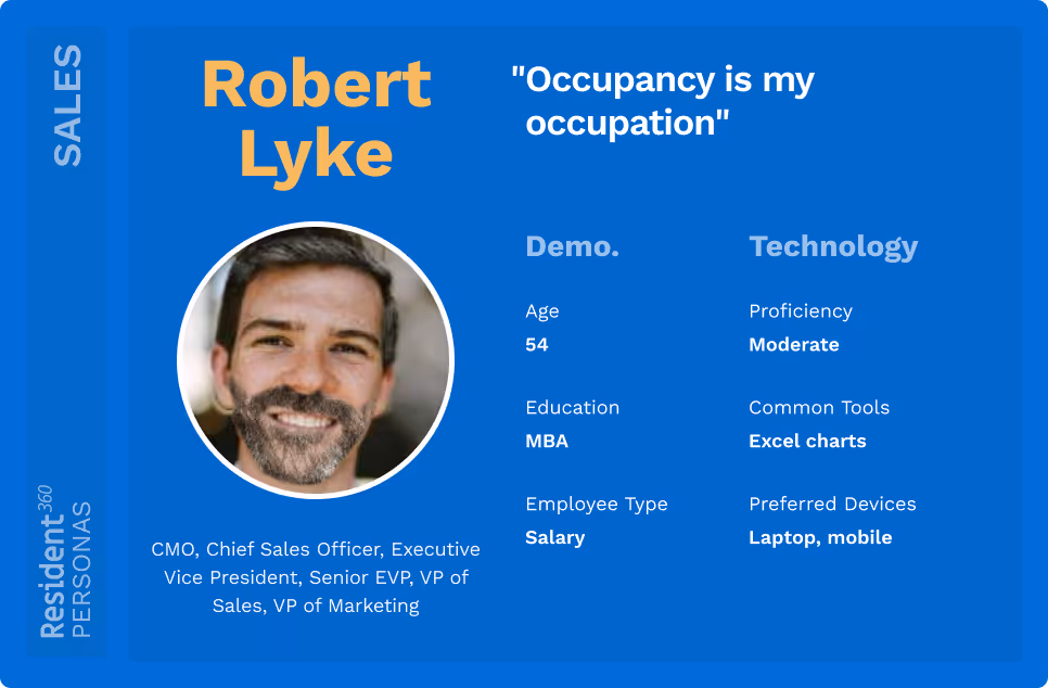
- I created personas for Sales Executives and Accounting Managers.
- I then identified their common pain points:
- Difficulty comparing performance across communities.
- Time lost compiling reports (average 8+ hours per week).
- Lack of historical trend visibility.

Timeline view for Sierra Place community
After developing persona sheets I socialized them with the team to keep user needs front-and-center.

3. Problem Statement
I then crafted a statement to encapsulate the product problem:
“Our users in the Home Office spend an excessive amount of time retrieving and calculating metrics. How might we leverage our existing data integrations to automate KPI calculation and reporting for them?”
This became a north star reference for decision-making throughout the project.
4. Design Process
Ideation & Alignment
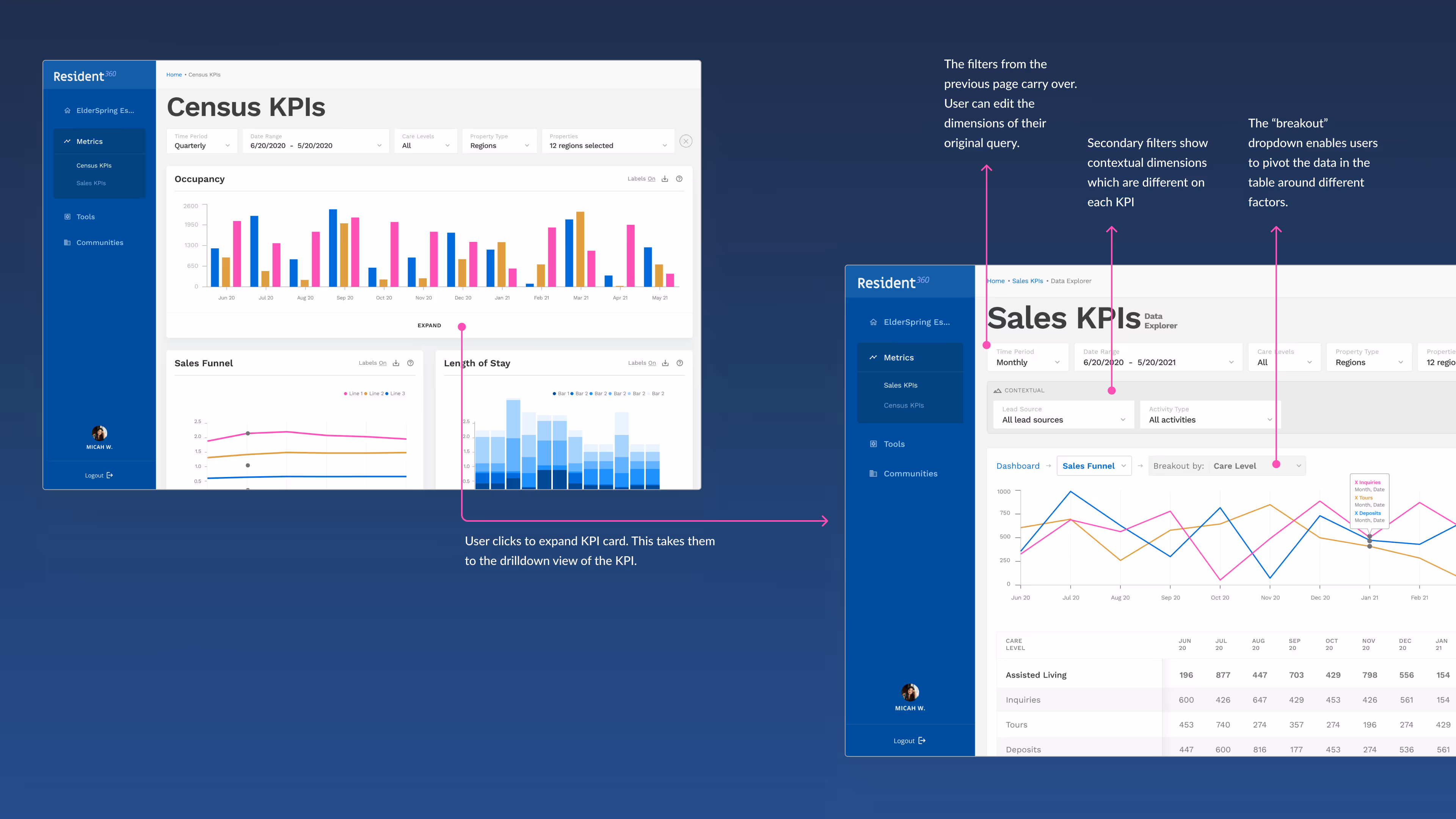
- Created quick wireframes tied to pain points → shared with product + engineering for feasibility discussion.
- Prioritized the MVP “Drilldown Flow” as Phase 1 of the product rollout.

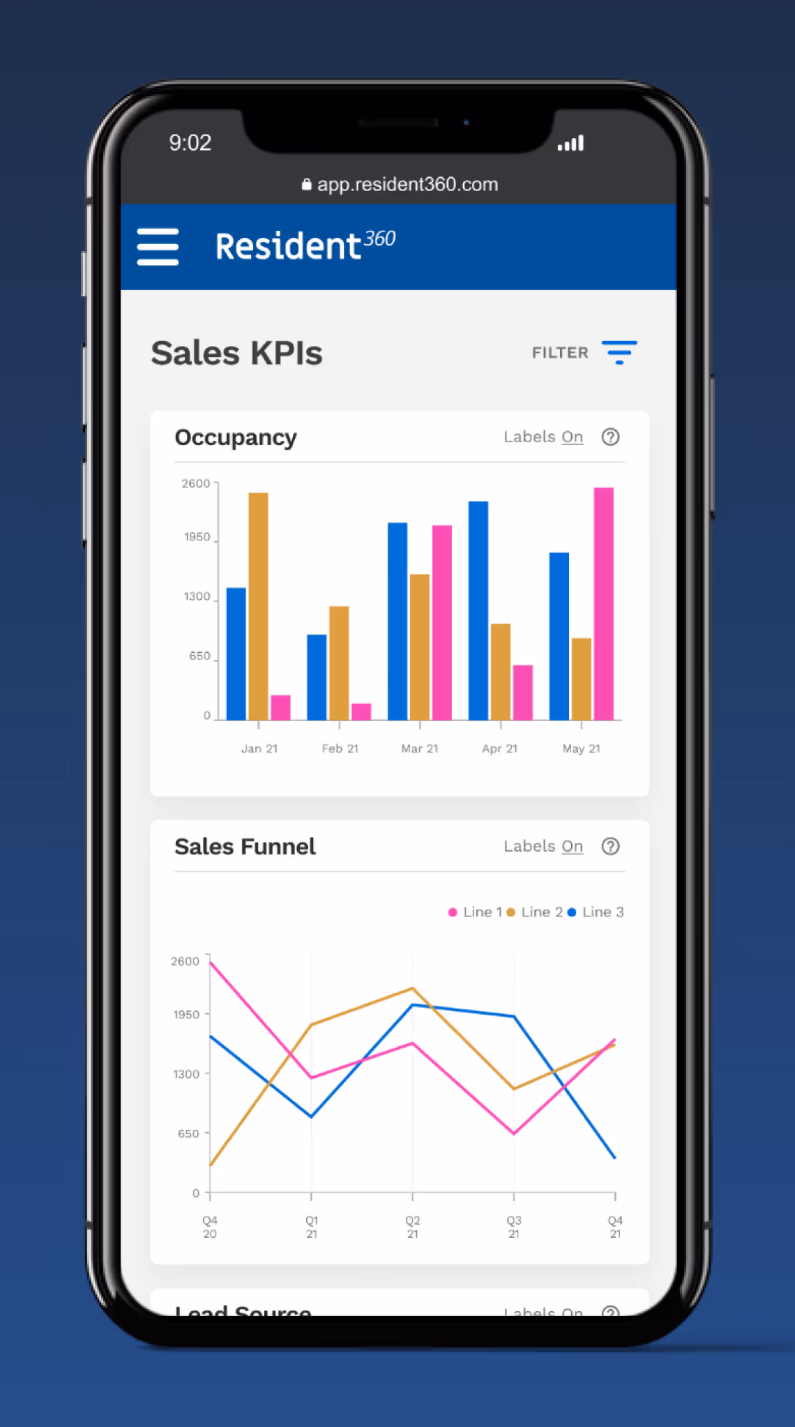
Dashboard view on a tablet device

Snapshot of early design
Iteration
- Leveraged design system foundations while building three new components:
- Card UI for KPI overviews.
- Chart variations for financial and sales metrics.
- Drilldown tables with interactive filters and dimension breakouts
- Iterated continuously as insights came in from users.
Prototype
- Delivered interactive prototypes in Figma. Refined based on customer feedback:
- Adjusted drilldown page to include additional filters + hierarchical views.
- Updated chart styles to match familiar paradigms (reducing learning curve).
Snapshot of hi-fi design
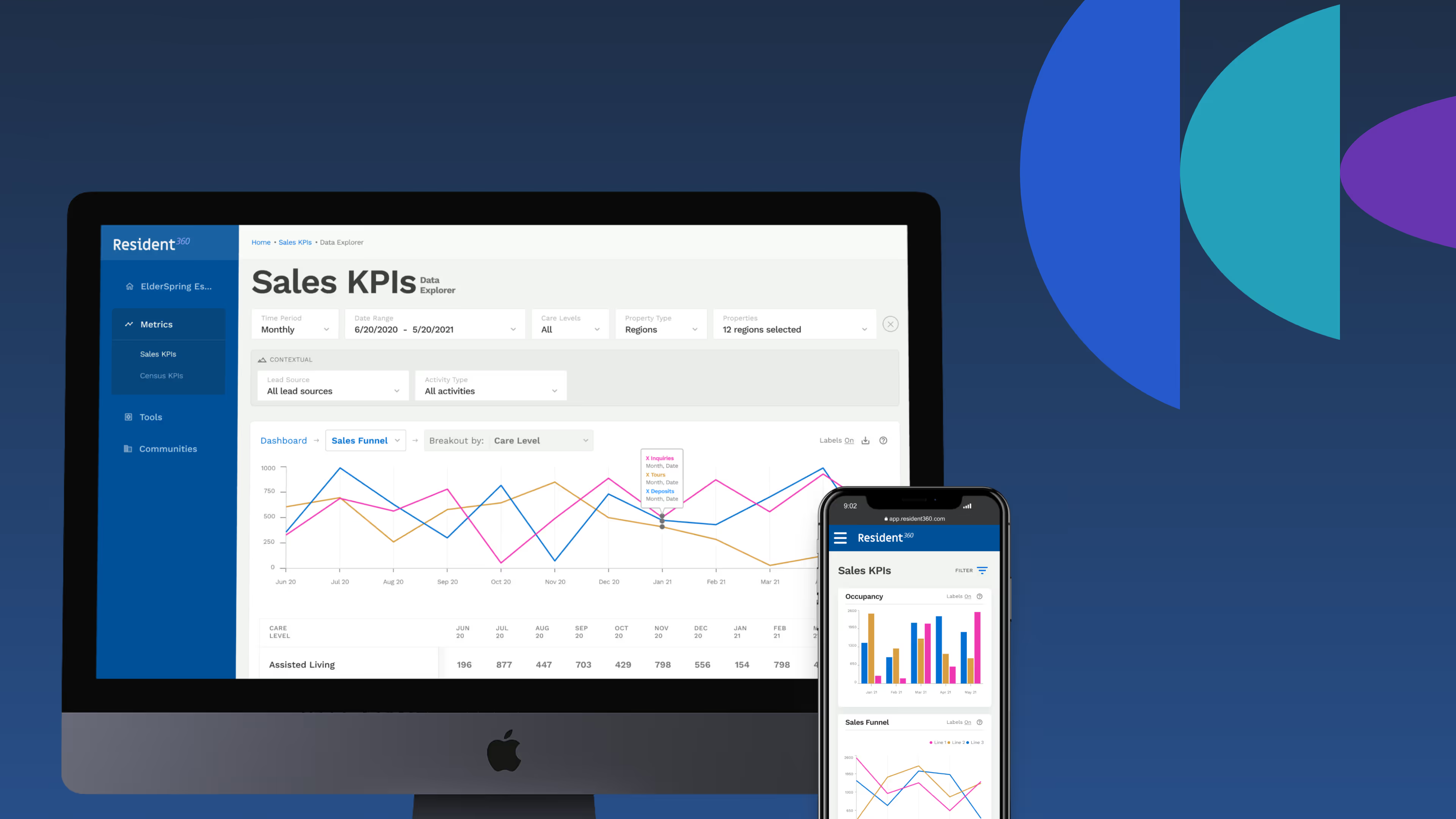
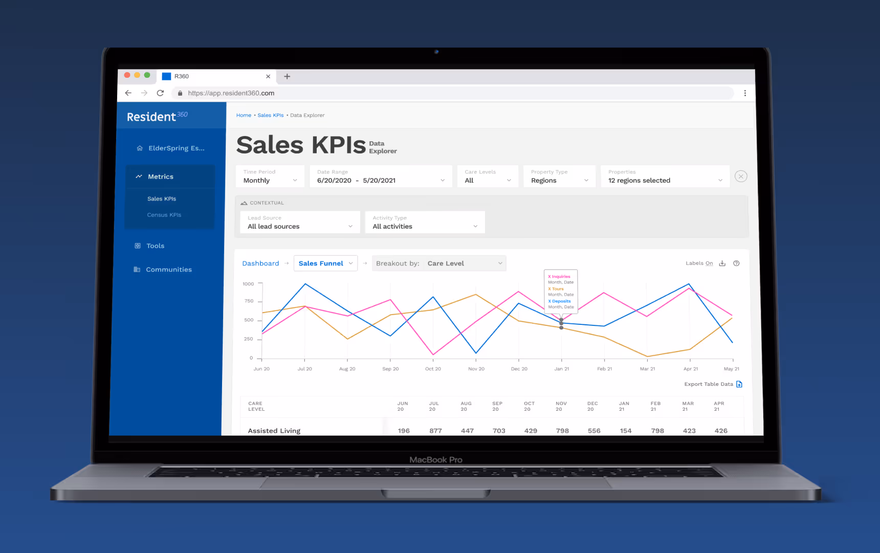
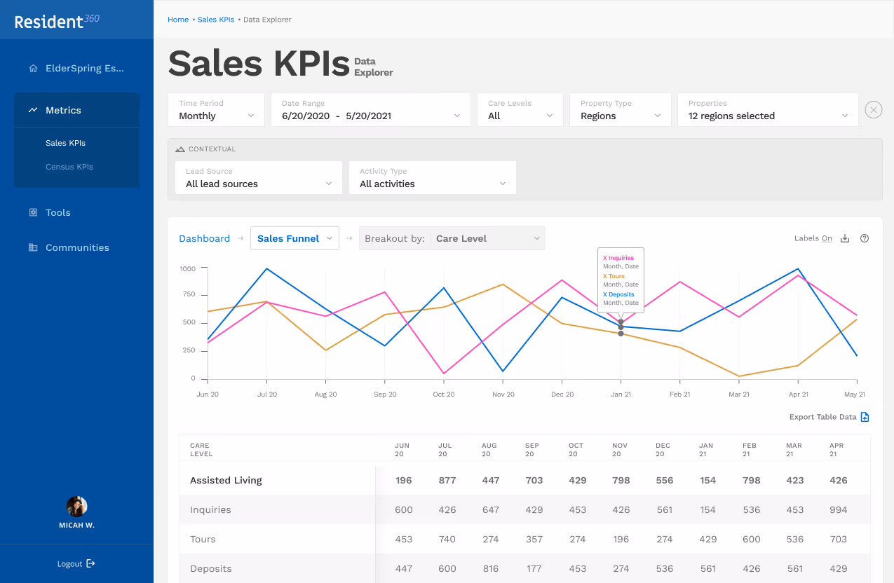
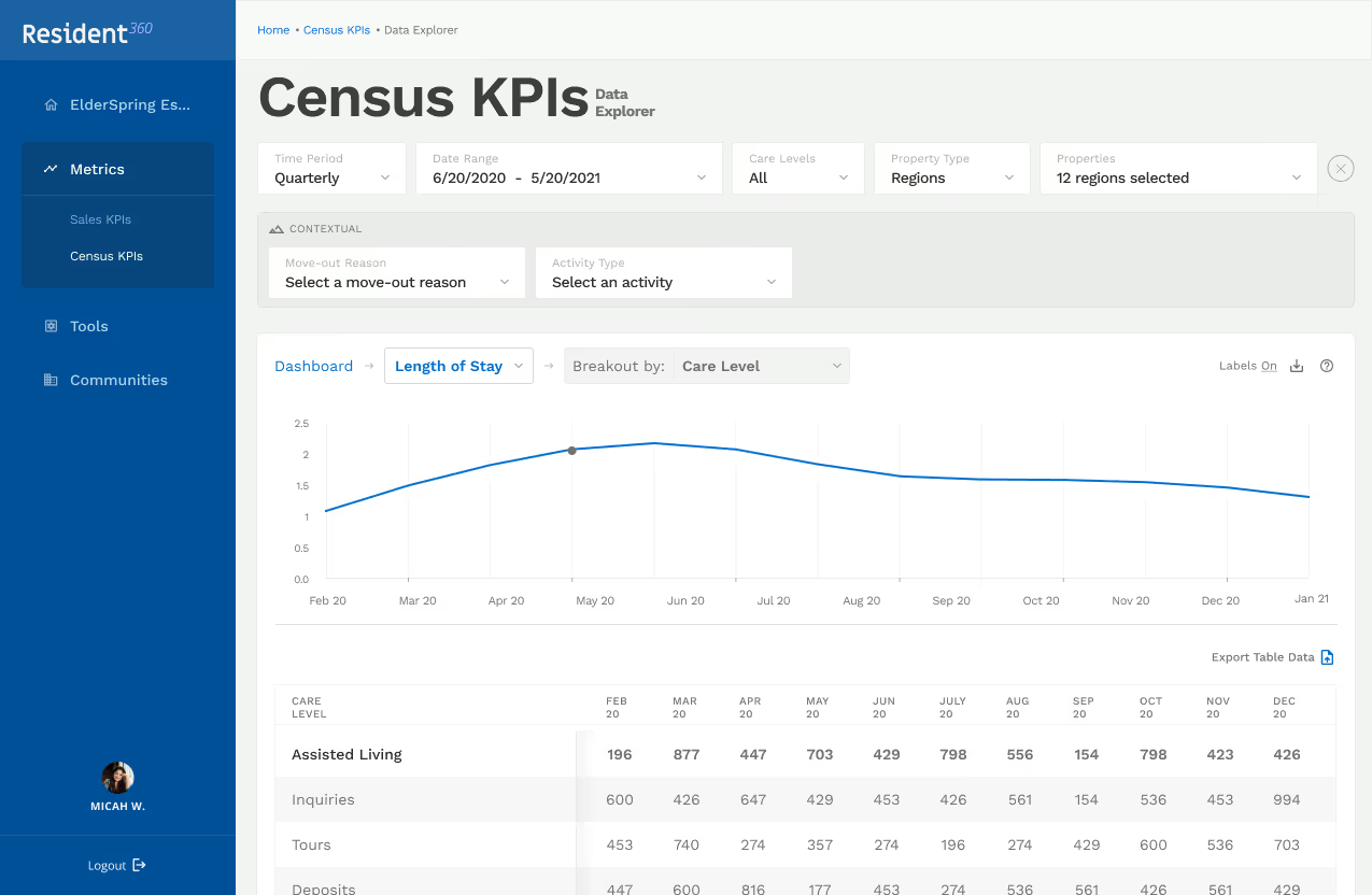
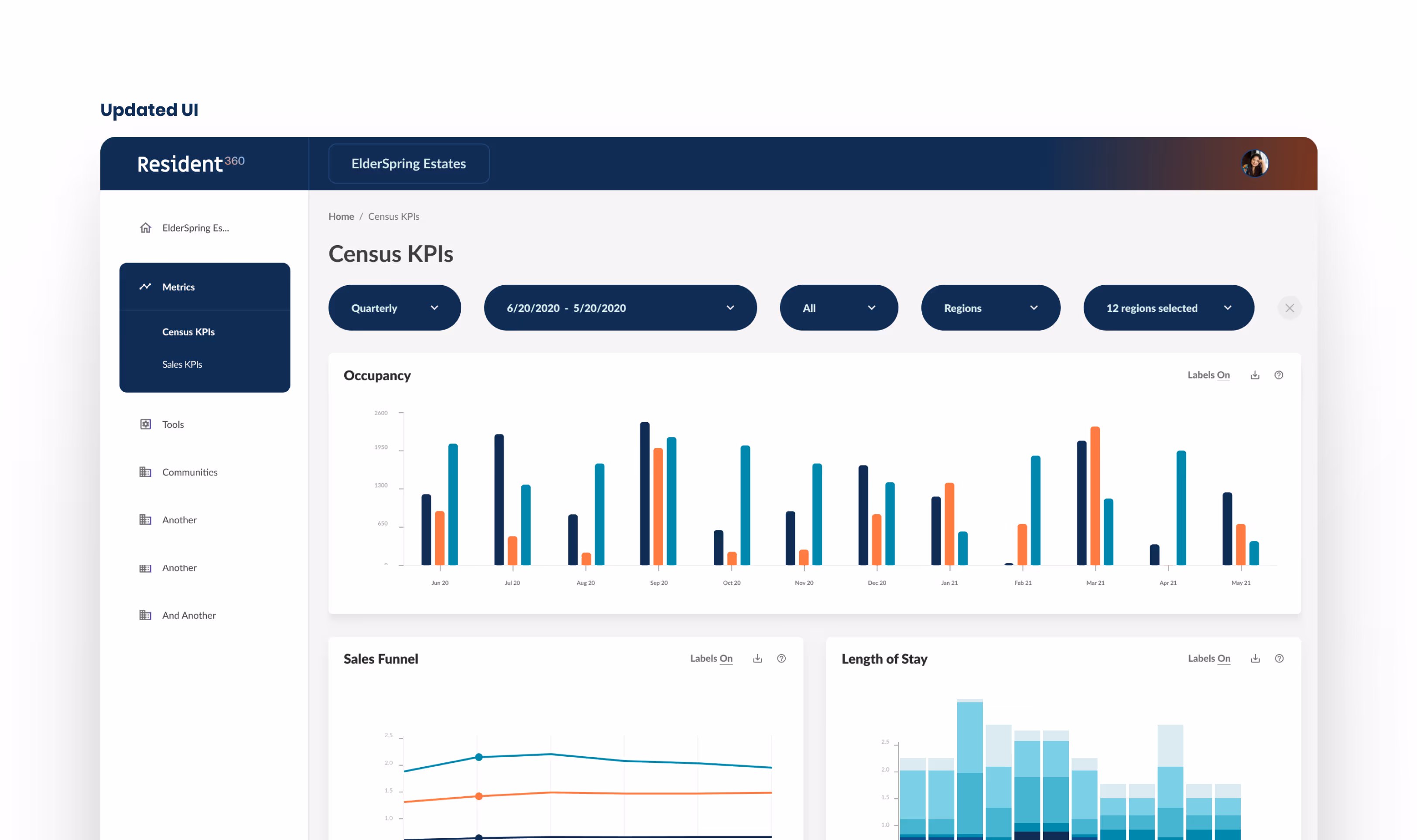
5. Solutions
The result was an experience that prioritized clarity and control. The design showed users a birds eye view of their key KPIs first, then empowering them to drilldown into the underlying data in great detail. All of this was done using patterns and interactions that our users were already accustomed to.

6. Handoff & Launch
- Throughout the project, I maintained tight collaboration with engineering through weekly touchpoints.
- For handoff, I delivered annotated flows, mobile views, color/typography updates, and new components in Figma.
- Components were folded back into the design system iteratively post-implementation.
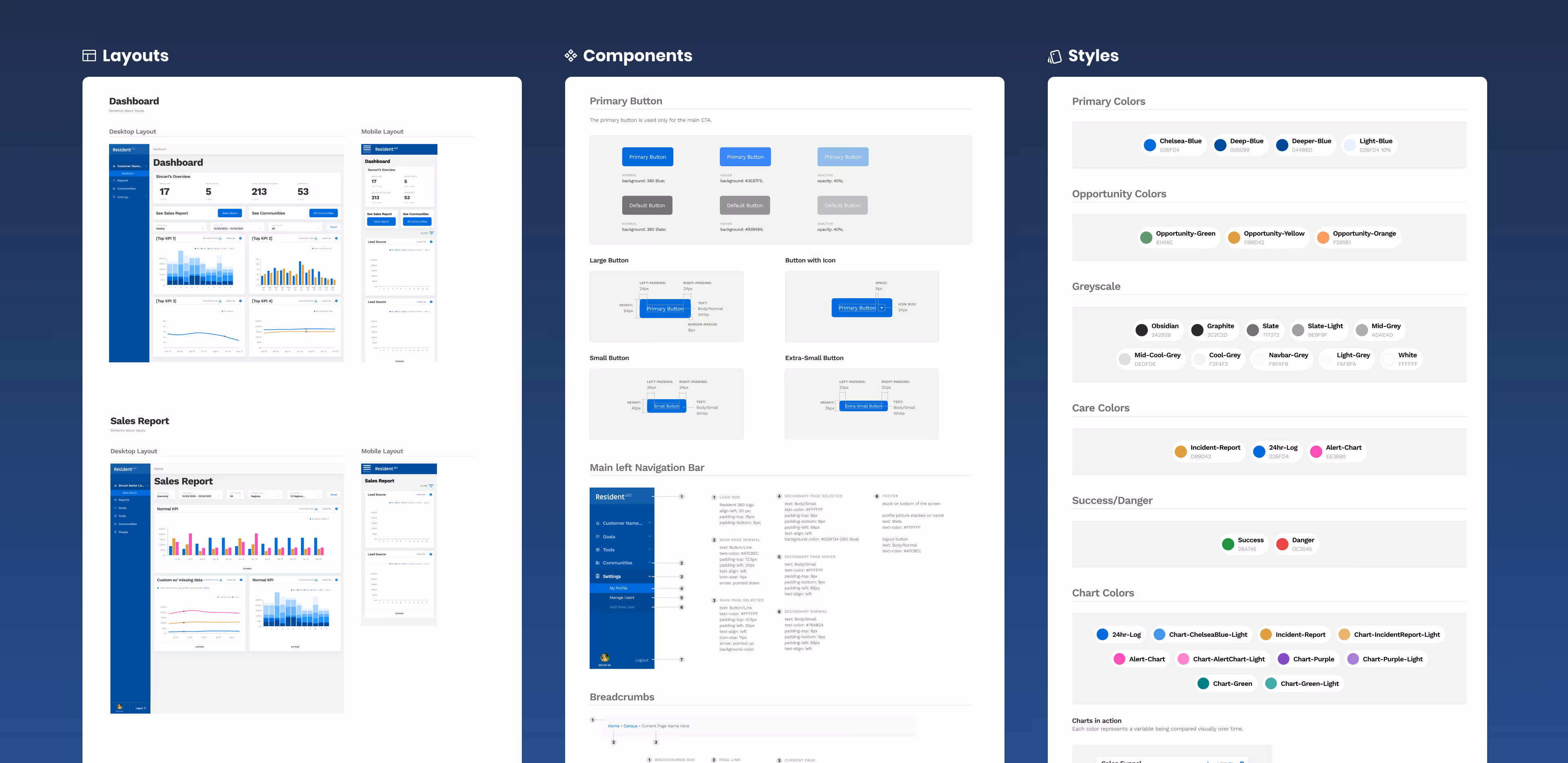
Snapshot of Figma design system
7. Results
8. Revisions & Learnings
1. Visual refinements
Iterated color palette, chart types, and typography to make dense data more scannable.
2. Key takeaway
In executive-facing tools, familiarity and trust in visualization patterns are as important as functionality.